Workshop programme
- Check installation
- Introduction
- Data cleaning
- Plotly
- Folium
- Tuning maps
Who are we
- Anastazie
- Data Scientist
- Background: gentics and forensics
- Filip
- DevOps
- Background: chemoinformatics
- Anastazie and Filip
- Organizing programming courses
- Working/consulting on data ananlysis/ devops projects
- Visit our courses
Usecase of this workshop
You are data scientist who uses Python almost daily for data cleaning and modelling. Sometimes you need to visualize results of your work. This time you need to plot your data on the map. You do not do it routinely (and you don't have background in geography), but you want to create quickly nice interactive visualization.
Type of visualization on maps
Scatter map
- Displays geographical data as data points on a map
- E.g. list of US ZIP Code Tabulation Areas used by Census Bureau
Bubble maps
- Circles are displayed over a designated geographical region
- Area of the circle proportional to its value in the dataset
- E.g. total alcohol consumption
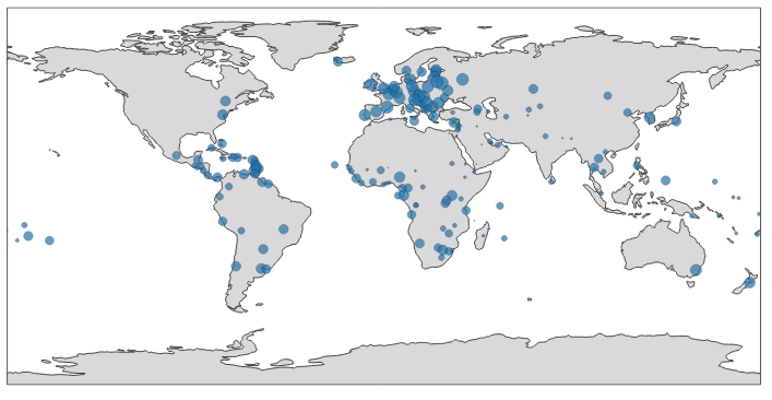
- E.g. total alcohol consumption
Choropleth maps
- Display divided geographical areas or regions that are coloured, shaded or patterned in relation to a data variable
- E.g. total alcohol consumption
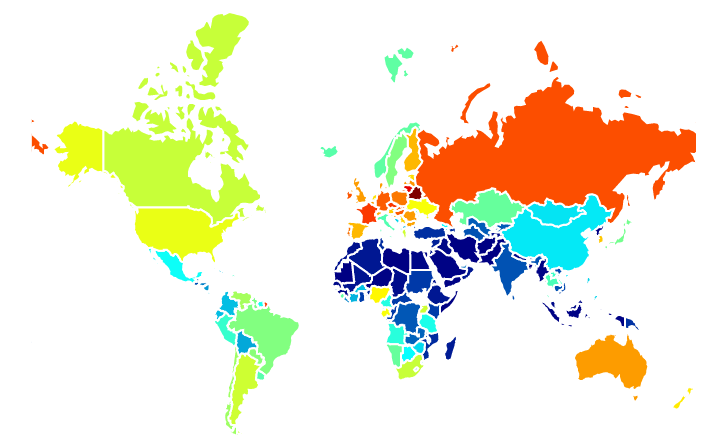
- E.g. total alcohol consumption
Import numpy and pandas
In [1]:
import numpy as np
import pandas as pd
from plotly.offline import iplot, init_notebook_mode, plot
import plotly.graph_objs as go
init_notebook_mode()
x = np.random.randn(500)
data = [go.Histogram(x=x)]
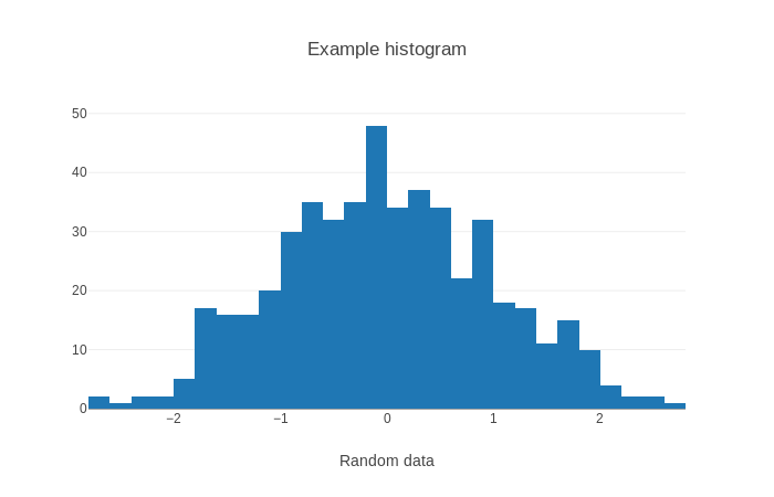
layout = go.Layout(title='Example histogram', xaxis=dict(title='Random data'))
fig = go.Figure(data=data, layout=layout)
iplot(fig)
plotly.graph_objslibrary contains graphical objects- E.g.
Histogram,Bar,Scatter,Choropleth - Also
FigureandLayout - You can also use syntax without graphical objects using
dict()
- E.g.
plotly.offlineenables showing plots without sending data to plotlyinit_notebook_mode()- Will make plots visible in Jupyter notebook
Figurecntains data to plot (must be a list) and layout
# dict() syntax
x = np.random.randn(500)
data = [dict(type='histogram', x=x)]
layout = dict(title='Example histogram', xaxis=dict(title='Random data'))
fig = dict(data=data, layout=layout)

iplot(fig)
Maps in Plotly
- No need to install any additional libraries
- Use three-letter country code for mapping
- Use coordinates for mapping
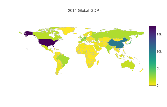
df = pd.read_csv('https://raw.githubusercontent.com/plotly/datasets/master/2014_world_gdp_with_codes.csv')
data = [go.Choropleth(
    locations = df['CODE'],
    z = df['GDP (BILLIONS)'],
    text = df['COUNTRY'],
    colorscale = 'Viridis',
    autocolorscale = False,
    reversescale = True,
    marker = go.choropleth.Marker(
        line = go.choropleth.marker.Line(
            color = 'rgb(180,180,180)',
            width = 0.5
        ))
)]
layout = go.Layout(
    title = go.layout.Title(
        text = '2014 Global GDP'
    ),
    geo = go.layout.Geo(
        showframe = False,
        showcoastlines = False,
        projection = go.layout.geo.Projection(
            type = 'equirectangular'
        )
    )
)
fig = go.Figure(data = data, layout = layout)
iplot(fig)
Folium
- Library devoted specifically to create interactive visualizations on map
- Python wrapper for JavaScript mapping library Leaflet.js
- Each map comes with possibility of zooming and moving area
- If you want English names on the whole map - use Mapbox
- Is not rendered by github
- Use nbviewer
- Gallery
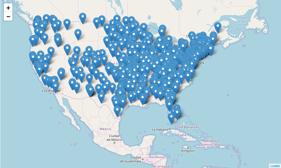
import folium
file_url = 'http://www2.census.gov/geo/docs/maps-data/data/gazetteer/2016_Gazetteer/2016_Gaz_zcta_national.zip'
df = pd.read_csv(file_url, sep='\t', dtype={'GEOID' : object})
#some column names have some extra padding
df.columns = df.columns.str.strip()
subset_df = df.sample(n=500)
example_map = folium.Map(
    location=[subset_df['INTPTLAT'].mean(), subset_df['INTPTLONG'].mean()], zoom_start=4
)
for row in subset_df.itertuples():
    example_map.add_child(folium.Marker(location=[row.INTPTLAT,row.INTPTLONG],popup=row.GEOID))
example_map
- In the beginning, we need to create
Mapobject - Icons are added to
Mapby creatingMarkerobject for each point- Markers can be aggregated by adding them to
MarkerClusterinstead ofMapdirectly
- Markers can be aggregated by adding them to
- Layers are added to
Mapusingadd_childmethod - Clickable layers can be added to
Mapusingfolium.LayerControl().add_to(example_map)
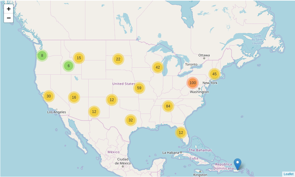
import folium.plugins
file_url = 'http://www2.census.gov/geo/docs/maps-data/data/gazetteer/2016_Gazetteer/2016_Gaz_zcta_national.zip'
df = pd.read_csv(file_url, sep='\t', dtype={'GEOID' : object})
#some column names have some extra padding
df.columns = df.columns.str.strip()
subset_df = df.sample(n=500)
mc = folium.plugins.MarkerCluster()
example_map = folium.Map(
    location=[subset_df['INTPTLAT'].mean(), subset_df['INTPTLONG'].mean()], zoom_start=4
)
for row in subset_df.itertuples():
    mc.add_child(folium.Marker(location=[row.INTPTLAT,row.INTPTLONG],
           popup=row.GEOID))
example_map.add_child(mc)
example_map
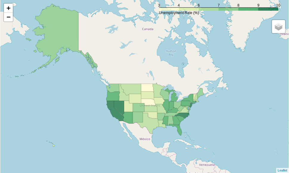
url = 'https://raw.githubusercontent.com/python-visualization/folium/master/examples/data'
state_geo = f'{url}/us-states.json'
state_unemployment = f'{url}/US_Unemployment_Oct2012.csv'
state_data = pd.read_csv(state_unemployment)
example_map = folium.Map(location=[48, -102], zoom_start=3)
folium.Choropleth(
    geo_data=state_geo,
    name='choropleth',
    data=state_data,
    columns=['State', 'Unemployment'],
    key_on='feature.id',
    fill_color='YlGn',
    fill_opacity=0.7,
    line_opacity=0.2,
    legend_name='Unemployment Rate (%)'
).add_to(example_map)
folium.LayerControl().add_to(example_map)
example_map